Origo Helps Rebrand ARC Ohio to Equitas Health – A Welcoming Healthcare Home For All
April 12, 2016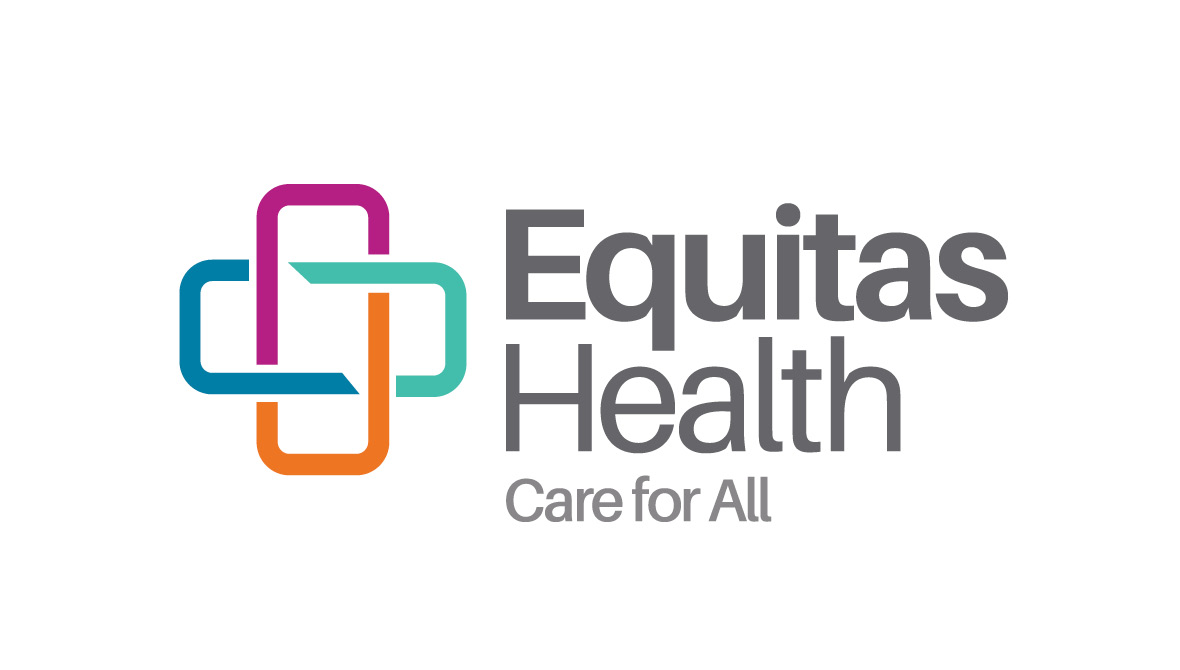
AIDS Resource Center Ohio (ARC Ohio) came to Origo with a simple (yet profound) goal: To help more people live healthier lives.
Over the course of the last 30 years, ARC Ohio had already established itself as a leader in the prevention, treatment, and advocacy of HIV/AIDS. As advances in medicine transformed HIV into a chronic, treatable disease, ARC Ohio recognized an opportunity to expand its services into comprehensive primary, social, and behavioral health.
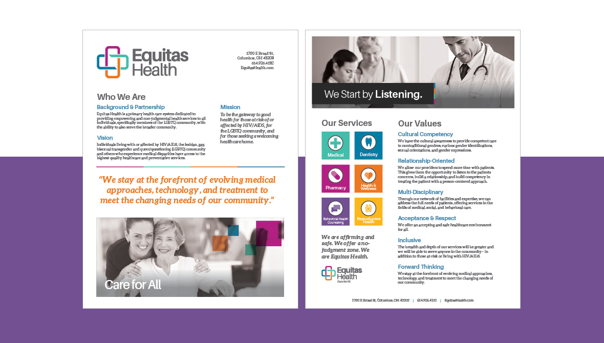
The organization’s new, expanded mission was, “To be the gateway to good health for those at risk or affected by HIV/AIDS, for the LGBTQ community, and for those seeking a welcoming healthcare home.”
To live up to this mission, ARC Ohio needed a completely revamped brand strategy–one that better captured the organization’s new goals. ARC Ohio was in need of new brand pillars, new visual identity, and a new name. Having a decade-long history with the Ohio Aids Coalition, Origo was a natural fit to help ARC Ohio achieve these goals.
This is how we helped.
Step 1 – Define the Brand
To begin the project, Origo worked with the ARC Ohio leadership team to develop the foundations of the new brand. We surveyed board members, staff, directors, external clients, and community thought leaders to gain insights that would drive the entirety of the project. We worked to define the following brand components:
- Brand Essence
- Positioning Statement
- Brand Personality
- Implicit Messaging Platform
- Explicit Messaging Platform
- Emotional Brand Appeal
- Rational Brand Appeal
- Tagline
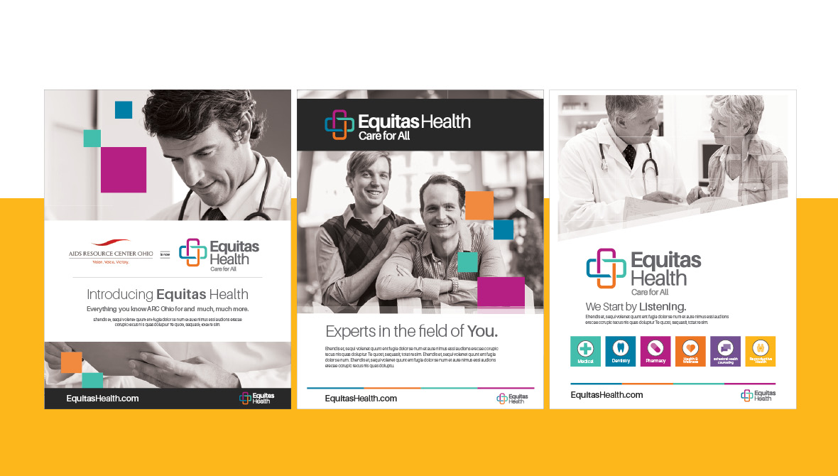
Step 2 – A New Logo & Brand Design
After developing the foundations of the new brand, Origo began creative development of a new visual identity–most notably, a logo. After several conceptual explorations, we landed on the logo and identity as you see it today. The new logo is a statement of inclusivity, teamwork, and diversity. And it communicates strength in serving those in need by working together as a team. The symbol shows four different colors and shapes coming together to create a greater entity, helping to demonstrate the message of collaboration, health, and community.
Step 3 – A New Tagline
With a new visual identity created, the next goal was to develop a tagline that was succinct, powerful, and ownable. After several explorations, the team agreed on Care for All. This new tagline reinforced the accepting and safe environment being provided to anyone seeking health services. It also captured the organization’s new, expanded mission.
Step 4 – A New Name
Our partners at Cement Marketing helped in creating the organization’s new name, Equitas Health. “Equitas” comes from Latin origins, meaning justice, fairness, and equity. These values have always been core to the ARC Ohio mission and this new name puts those values at front-and-center.
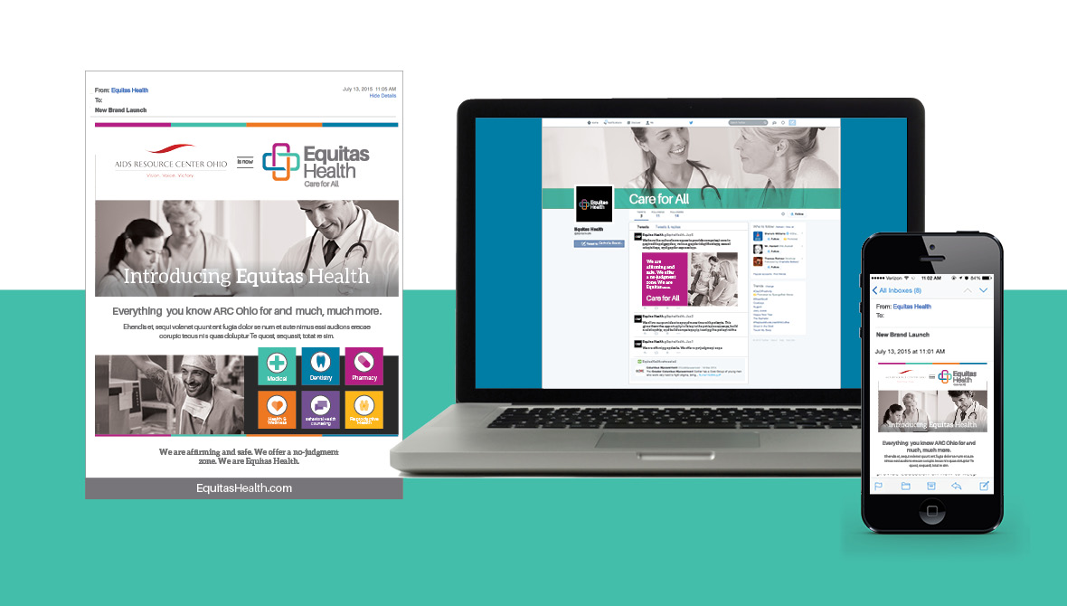
Step 5 – New Brand Guidelines & Messaging Strategies
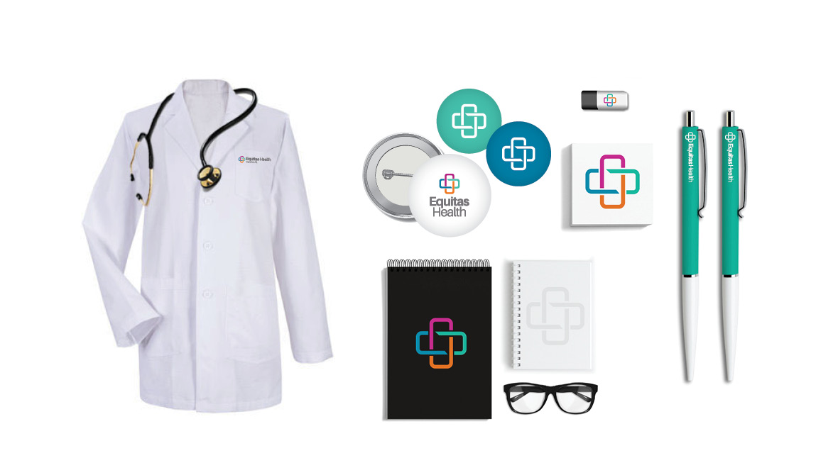
Once the brand was established, Origo created a new brand guideline on how to properly use the brand to ensure consistency through all communication methods. This included various templates for the Equitas Health team that would help them develop new materials and touchpoints for their brand–like advertisements, collateral, social media pages, posters, invites, and email signatures.
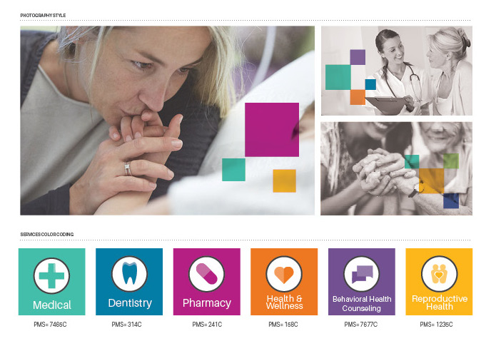
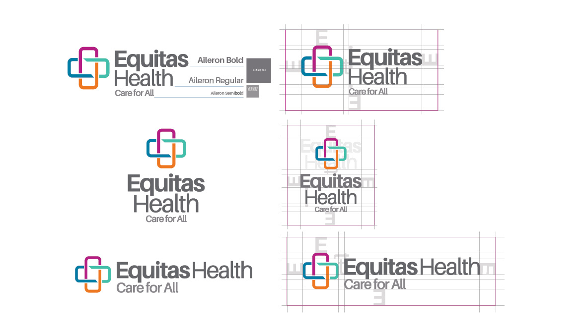
The brand guidelines also included a full description of what the brand represents, as well as guidance on logo usage, lockups, and treatments, along with a guide to the primary and secondary color palettes.
Origo was proud to have been a part of this project, and we’re excited about the impact Equitas Health will have on our community. From beginning to end, this was a truly collaborative process and we look forward to watching this new brand evolve.
To learn more about Equitas Health, visit their new website.